Branding and Product Design
- Branding
- Product
- Logo
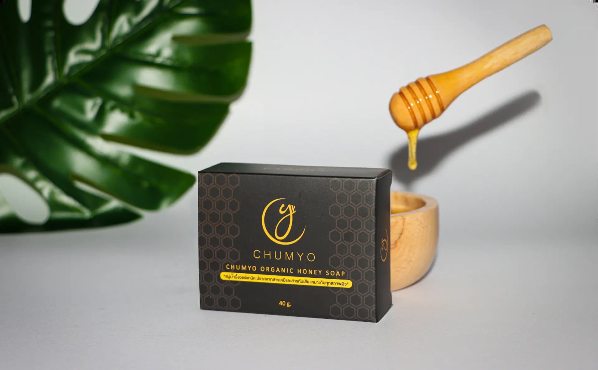
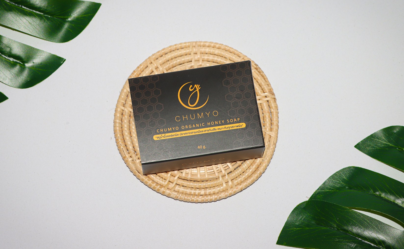
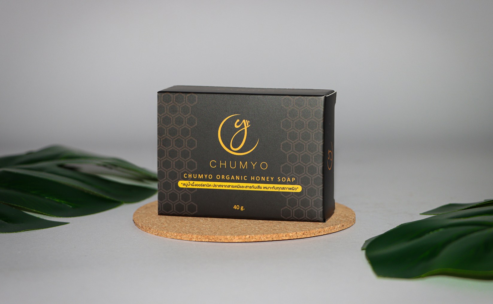
End-to-end branding for Chumyo, a honey soap brand. The project covered mood-boarding, logo design, typography selection, packaging structure, label artwork, and final product mockups to create a warm, natural brand identity.
Chumyo Soap Brand
Inspiration to design this soap box. Since family members like to do business and trade as capital and coinciding with my family, there is a small business producing honey soap for sale. But since it was not intended to be the main business, therefore, we did not realise the importance of the product in the packaging. For that reason, I decided to redesign this soap box.
SWOT
Strength
- 1. It is organic soap.
- 2. Its fresh because it is a new brand
Weakness
- 1. The brand is not very well known.
- 2. Low production capacity because it is a handmade product.
Opportunity
- 1. People turn to love health. Making organic products more attractive.
Threat
- 1. The covid19 situation has reduced people's income and cut out unnecessary expenses.
Design Brief
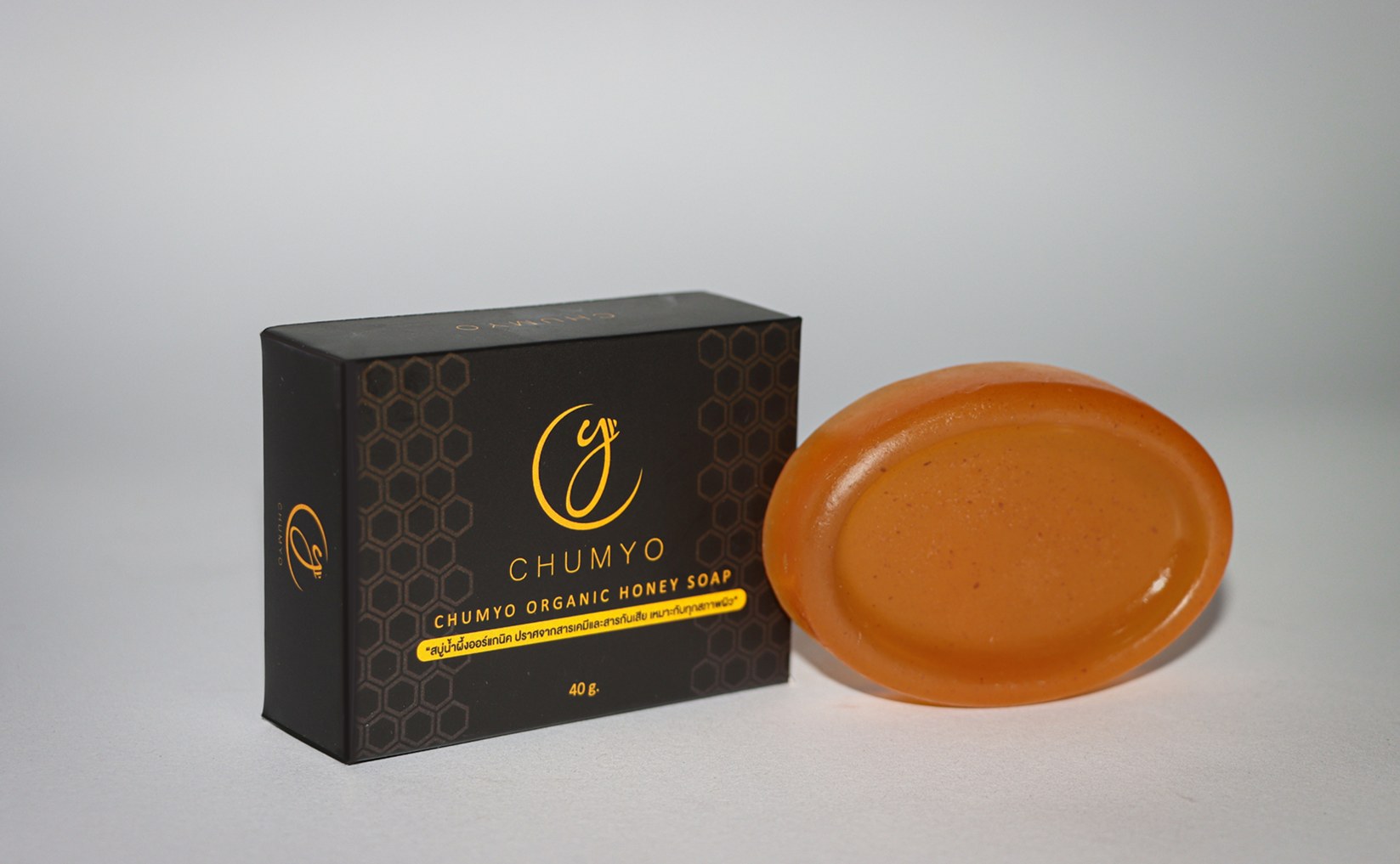
It is a natural soap that contains a mixture of honey, chemical free.
- Font
- Customers want the main font of the word Chumyo is a minimal and very soft. The fonts are simple and easy to read.
- Logo
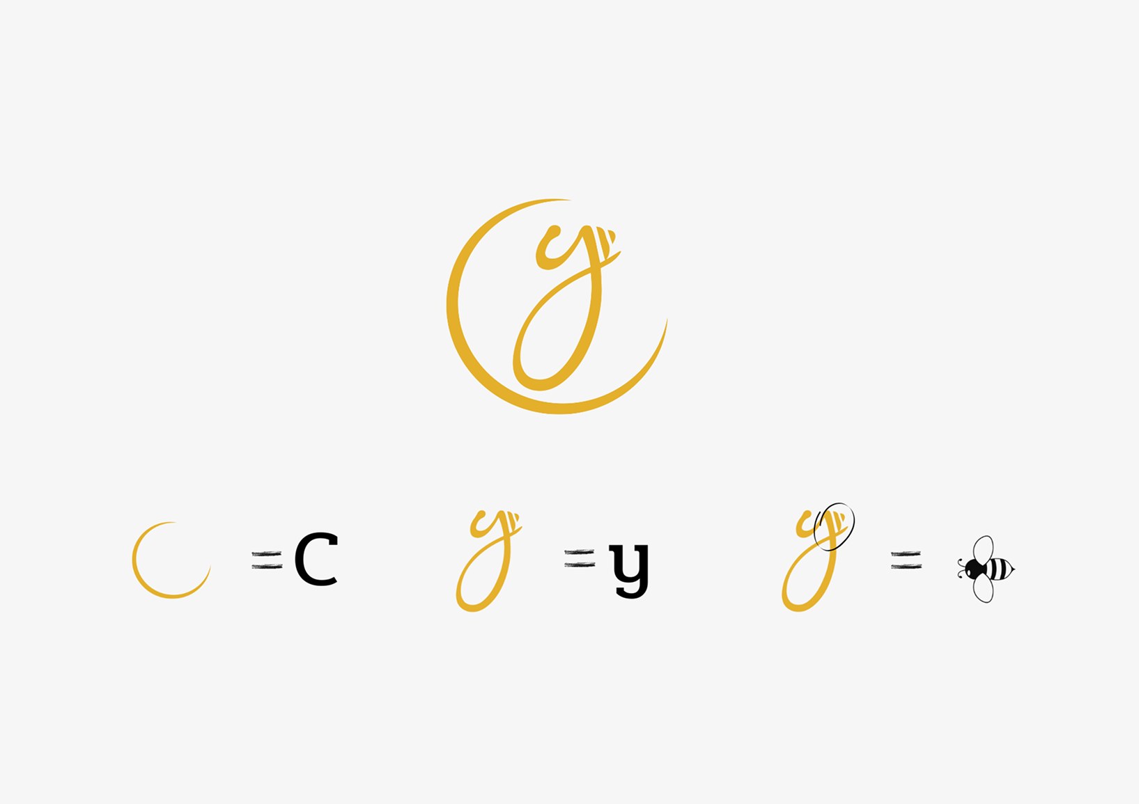
- The logo wants to see and know that it is a soap made from honey. Without using bees to have the abbreviation CY.
- Soap box
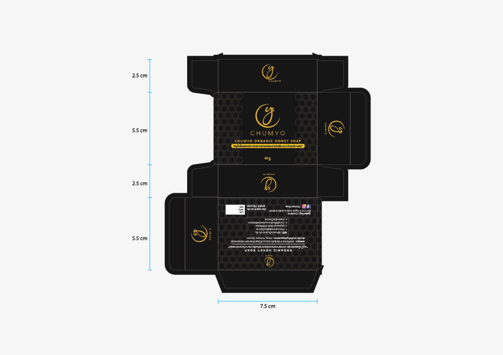
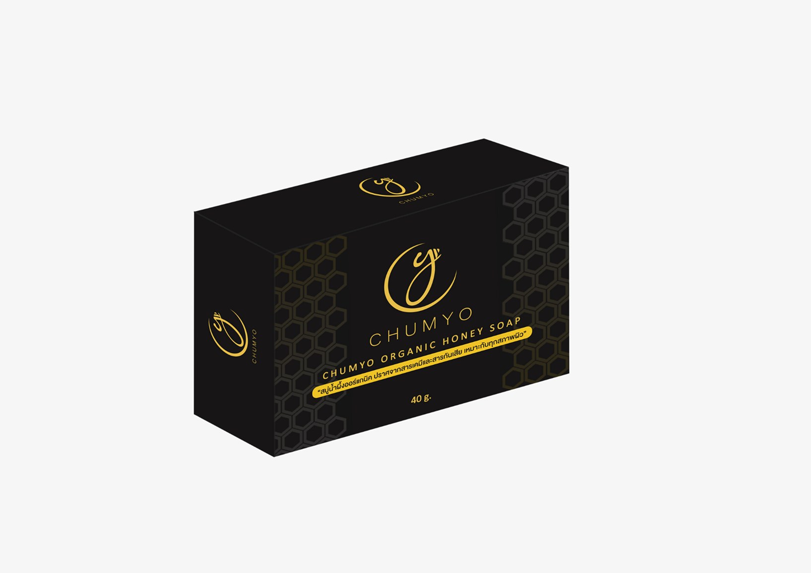
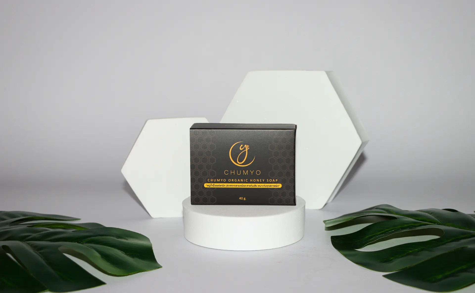
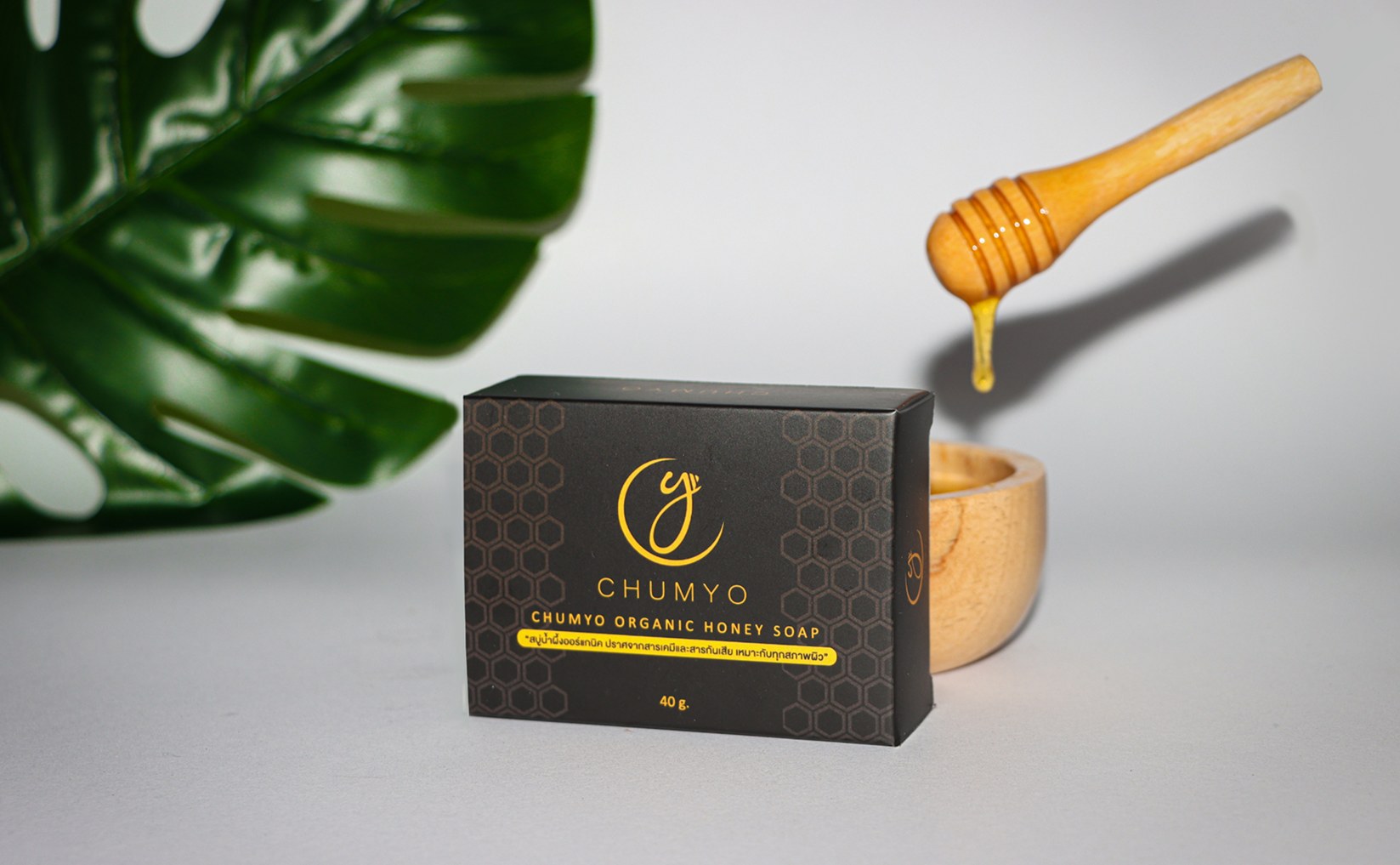
- Box shaped in square shape. Saw and caught the eye. Customers want the color that has been seen to give an elegant feeling and to know that it is honey soap.
- Box design
- Customers want it to look a little luxurious, but not. Because it is a price that everyone can afford.
- Color Palette
- Customers want the color black, yellow, or gold.
Honey Yellow
#E4B660
Gold
#E5B031
Amber
#CA8F31
Black
#000000
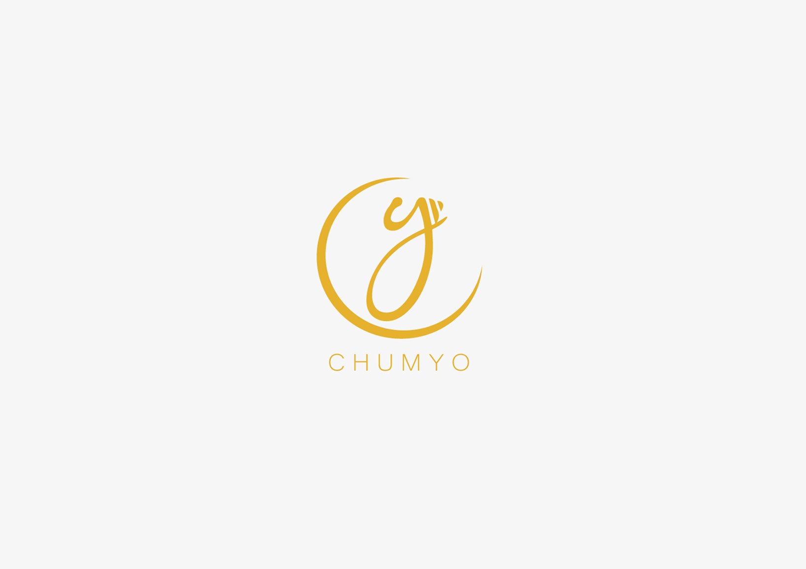
Final Design Logo
Final Design Box
Tools & Methods
- Adobe Illustrator
- Adobe Photoshop
- Adobe Lightroom
- Packaging mockups